CASE STUDY 2026
Youtube Comment Analyser
A web based app that analyses youtube comments and related metadata to come up with a dashboard containing key insights.
Problem
Whenever i watched a youtube video, i got a curiosity like “what are people saying about this video, what is their opinion”, and scrolling through all the comments would take a lot of time + it was not accurate enough, so i thought what if i can come up with an automated system which would cover all comments in no time.
Approach
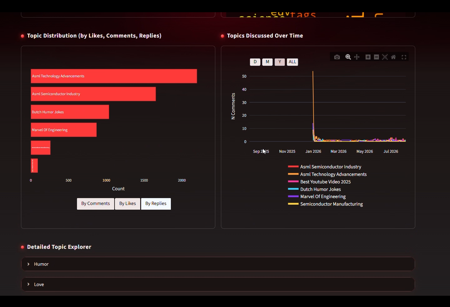
So,my original idea was to pull out all the separate topics from the comments, and make sort of a bar graph to know which topics have how many comments.
To achieve this, i thought there must be some kind of clustering, and comments can be represented using vector embeddings.
Then i thought of K-means clustering, but the major issue was that you don’t have predifined topics in youtube comments, there can be 5 or 50 topics, it depends on factors like quantity of comments, cultural diversity, and content.
So finally, i thought of DBSCAN clustering , which would dynamically group all comments in distinct clusters (topics), and with the feature that each comment gets a distinct topic.
So i landed at BERTopic Framework, which had a pipeline from preprocessing to topic modelling for this task, and used UMAP [currently] for dimensionality reduction, since running DBSCAN on all 384 dimensions would have “dimensional curse”. The problem with UMAP algorithm is that it doesn’t account for global view of data points, so intra-cluster arrangement is good, but inter-cluster arrangement might not be good, which might cause two semantically different topics to be close to each other i.e. similar in the reduced space.
However, in future releases, i’d changed this flow to use Cosine similarity instead of Euclidean distance, because that’s more natural for vectors, but for that i’d have to actually evaluate if things are getting better or not.
For frontend, i used Streamlit because that would save my time since i don’t have much knowledge of js.
So the basic idea was to retrieve topics [Bertopic + local LLM], calculate all required dataframe or dictionary variables, and come up with visualizations, the whole project depends on topic modelling since if you know what topics are talked about and correctly cluster them, you can know how many people are liking you, disliking you, what people think over time, what kind of audience do you have, etc, so i explained the whole approach.
I first laid the foundation of topic modelling, then i did some permutations and combinations on the “calculating variables” part, then i came up with some visualizations that would present those in a meaningful way.
I used plotly because that was modern, and interactible, however it was also a little bit bugged.
THINGS THAT I KEPT IN MIND :
1. Dashboard cards should follow Z pattern for utmost visiblity and clear heirarchy.
2. Each Color and its values have meaning, for example, Green color has its meaning, but if we make it less saturated that makes it less catchy to eyes and consequently less important, this is the same thing i did with the hate part in the pie chart.
Result
The Result was a Web-based AI app where you just give it the youtube url, and it would analyse it in minutes and Present it to you in the form of a nice looking dashboard.
Future Scope
Future releases would be focussing on :
1. Optimizing topic modelling & insights generation.[lets see if we can use lighter models or just LSTMS]
2. Adding Login-Logout.
3. Saving the Analysis Results in a Database + coming up with Updation logic [if time gap is large enough].